this page is a gallery of almost all of the visual art i've produced and published online.
each piece is accompanied by its title, date, and medium, as well as small bits of commentary on the piece.
all art is arranged in chronological order, with the most recent pieces towards the top.
many of these works have been shrunk to fit the page, so if you wish to see a piece in more detail you can right click it to view it in a new tab.
lastly, some images are hidden by default due to potentially sensitive content, and appear as an image of blue and pink stars. to view the actual image, click on the button in the piece's description.
please peruse and enjoy at your leisure :>
in interest of keeping this gallery clean, there is a seperate page for showcasing my sketches, comics, and other less serious art. that page can be found here!

november 2025
digital logo design
this is a logo for the FFXIV RP venue 7th Chord run by my friend Veil Ori'anami! The 7th Chord is a dive bar with a musical focus combined with the modern Alexandrian aesthetic. To showcase these ideas, the logo depicts the venue's name in bright neon Alexandrian script overtop a rough graffiti-style base depicting equalizer bars, symbolising the digital music.
august 2025
digital logo design
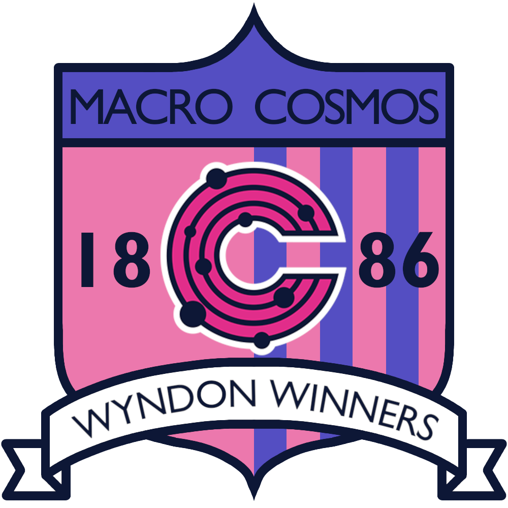
this is the logo for my team in the Galar-based eighth season of The Citrus League, a competitive pokemon-battling sports league between friends. the Macro Cosmos Wyndon Winners franchise represents the city of Wyndon in Galar, and is graciously sponsored by Macro Cosmos, the business conglomerate headed by Chairman Rose. as Galar is based on England, i took inspiration from football clubs, particularly Enfield Town FC, Dulwich Hamlet FC, and La Equidad. inspiration also came from corporate sponsored teams, like the New York Red Bulls. Chairman Rose is a blatant parody of the modern businessman, so Macro Cosmos was a perfect fit, with a their magenta and blue logo being a bonus. for the 1886 founding date, that was a random year picked to fit the general time a lot of London FCs were founded in real life. canonically, the Wyndon Winners brand was founded back then, but disappeared for a long time, and Macro Cosmos recently took the name for their own team. despite the fact that the new team is entirely different from the original Winners, they are still claiming their 1886 founding date for clout.
april 2025
digital logo design
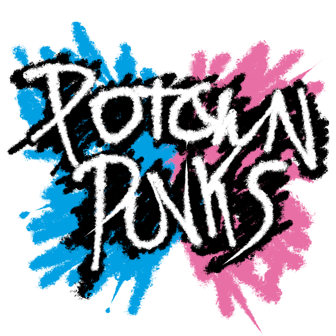
this is the logo for my team in the Alola-based seventh season of The Citrus League, a competitive pokemon-battling sports league between friends. the Punks franchise represents Po Town in Alola, occupied by the rambunctious Team Skull. Like the Distortion's logo, the Punks logo goes for a, well, 'punk' style, with a spray-painted logo featuring bold colours and sharp angles. Tying into the Po Town theme, the colours are directly based on the Team Skull grunts, the blue and pink coming from their hair and eyes. Additionally, the two O's in 'Po Town' mimic the 'sun and moon' motif in Team Skull's designs, as seen on the grunt's hats and Guzma's glasses. Despite being largely unprofessional, the Punks managed to get a spot in the Citrus League through a surprisingly coordinated sit-out of the Citrus League's Alolan branch office. The Citrus League management bending to their demands has caused no small amount of controversy, but the Punks relish the attention, good or bad.
november 2024
digital logo design
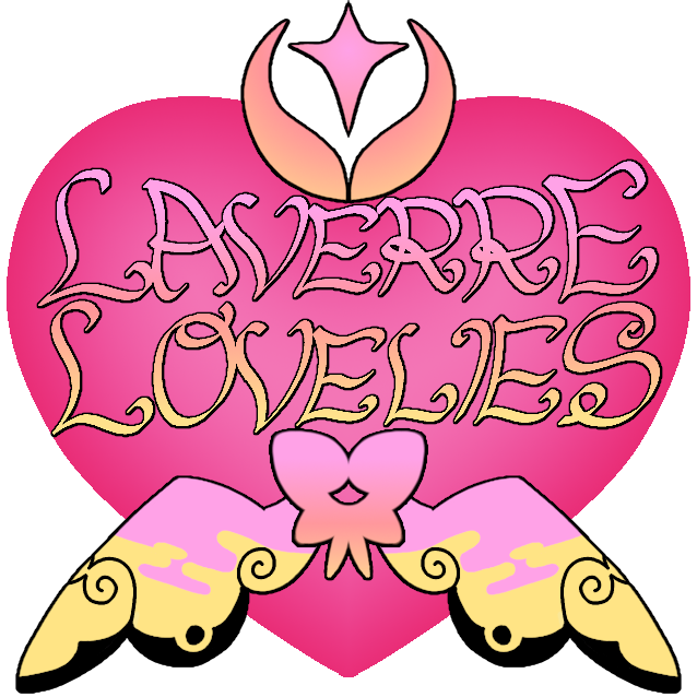
this is the logo for my team in the Kalos-based sixth season of The Citrus League, a competitive pokemon-battling sports league between friends. the Lovelies franchise represents Laverre City in Kalos. The Lovelies are a team that focus heavily on the Fairy type (if it wasn't obvious by the, well, everything.), being a major player in the grassroots movement to get Fairy recognized as an official type. The Lovelies are also well known by league enthusiasts for their fashion, with many of the players and staff going beyond basic jerseys and instead innovating in the space of chic sports-ready outfits. The Lovelies had a solid season, picking up wins through the hard work of players like Ringo Starkey the Klefki, Rory the Aurorus, and Nyannabel the Meowstic. Tragically, they broke the rules by fielding two legend-tier players in one battle, and thus have been disqualified from participating in the next season.
june-august 2024
pencil on paper
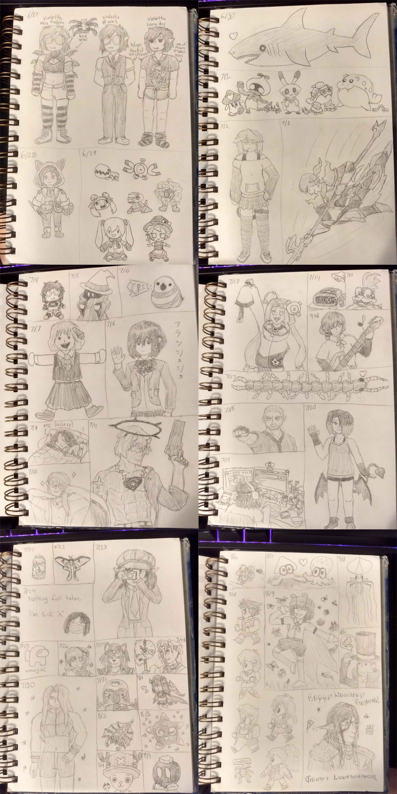
this is a collection of drawings i made during the summer of 2024. as something fun to do during the break, i decided to try drawing something every day. it was a really fun challenge, and helped a lot with breaking some of the artist block i had been going through recently. some of the pieces from this daily challenge (specifically the ones featuring violetta and scarlet) have been cleaned up and coloured digitally, which can be found elsewhere on the site. if you want a closer look and some thoughts on any particular piece, i have individual posts for each one that can be found on my tumblr! when i started, i didn't have any real plans for how long i would stick with it, planning to drop it if/when i ran out of juice. im pleased to say i made it almost the entirety of the summer since starting, only ending because my school semester was starting back up again. i might try this again next year!
july 2024
digital logo design
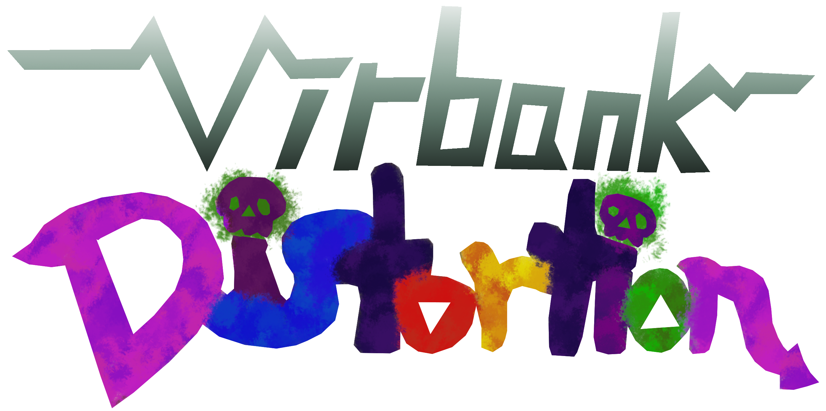
this is the logo for my team in the Unova-based fifth season of The Citrus League, a competitive pokemon-battling sports league between friends. the Distortion franchise represents Virbank City in Unova. the general concept behind the team is to base it on a poisonous punk-rock aesthetic in the same vein as Virbank's gym leader Roxie. the name 'Distortion' comes from the effect pedal used for electric guitars. i struggled a lot with art/writers block when concepting this team, especially when it came to deciding on a 'mascot' pokemon. eventually i decided to skip out on one, so the logo doesn't feature any pokemon design language, even indirectly. i wouldn't say this one is bad, but i am a bit disappointed in how this one turned out. i tried some new techniques to get the sort of look i was going for, including using a physical sketch as a baseline which was a first for these logos, but i couldn't really get it to look the way i pictured it in my head. the season itself was fun at least, with some of the standout players being Audrey the Audino, バスキュリンさん the Blue-striped Basculin, and EYE OF DA MUMMY the Cofagrigus.
february 2024
digital logo design
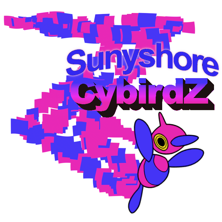
this is the logo for my team in the Sinnoh-based fourth season of The Citrus League, a competitive pokemon-battling sports league between friends. the CybirdZ franchise represents Sunyshore City in Sinnoh, and harkens back to my season one team the Celadon Cybirds. Fittingly, the mascot of the CybirdZ is a Porygon-Z, an evolution of the original Cybirds mascot Porygon added in the Sinnoh games. This logo mostly was made as a parallel to the original Cybirds one, with similar design aspects but done slightly differently, such as the trail being a Z shape rather than a C one, and bolder purple-r colours that contrast with the brighter pastels of the Cybirds. The choice of Sunyshore city was mainly to keep the alliteration, but its also a high-tech sort of city with its electric gym and raised solar-panel walkways.

january 2024
digital logo design
another team logo created for The Citrus League, a competitive pokemon-battling sports league between friends. the LaRousse Legends were the team i ran for a small tournament cup based around the Gen 4 Ubers metagame, so i made this team brand to fit that idea. LaRousse refers to LaRousse City, the setting of the Destiny Deoxys movie, and Legends is a reference to legendary pokemon as well as being alliterative. the design of the logo is based on the battle tower and some blocky robots from the forementioned movie.
october 2023
digital logo design
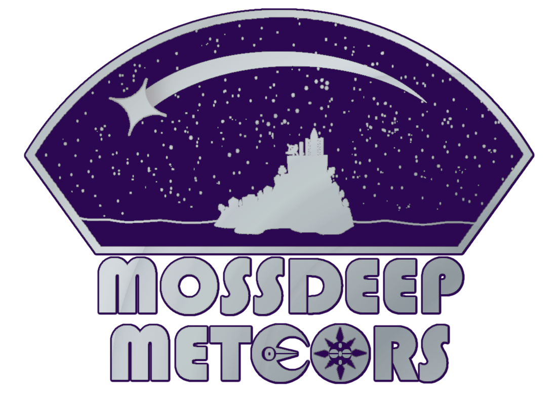
this is the logo for my team in the Hoenn-based third season of The Citrus League, a competitive pokemon-battling sports league between friends. the Meteors franchise represents Mossdeep City in Hoenn, with the logo style meant to evoke a badge or patch seen on a NASA astronaut uniform. the EO in Meteors being a Lunatone and Solrock are references to the ace monsters of Mossdeep gym leaders Tate & Liza, as well as being space-bound pokemon and players on the Meteors team.
october 2023
digitized sketch + digital painting
content warning for: insects, blood, body horror.
july 2023
digital logo design
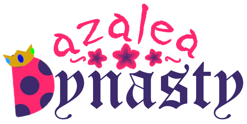
this is the logo for my team in the Johto-based second season of The Citrus League, a competitive pokemon-battling sports league between friends. the Dynasty franchise represents Azalea Town in Johto. the D in the Dynasty logo is a Ledian elytra with a crown on it, representing the ace monster of the Dynasty, Lady Azalea, who is a Ledian. the name for the Dynasty originally came from the scientific name for the hercules beetle Dynastes hercules as the initial plan was to base the branding around Heracross. Over time i shifted lanes away from Heracross and towards Ledian instead, with Dynasty still fitting thematically in the more royal sense in relation to ladybugs. For the Heracross fans out there, dont worry: Sir Gladiolus the Heracross was a mainstay in the Dynasty roster throughout the season, masterfully defending his Lady from the prevalent Snorlax threat.
june 2023
touched-up ms paint sketch
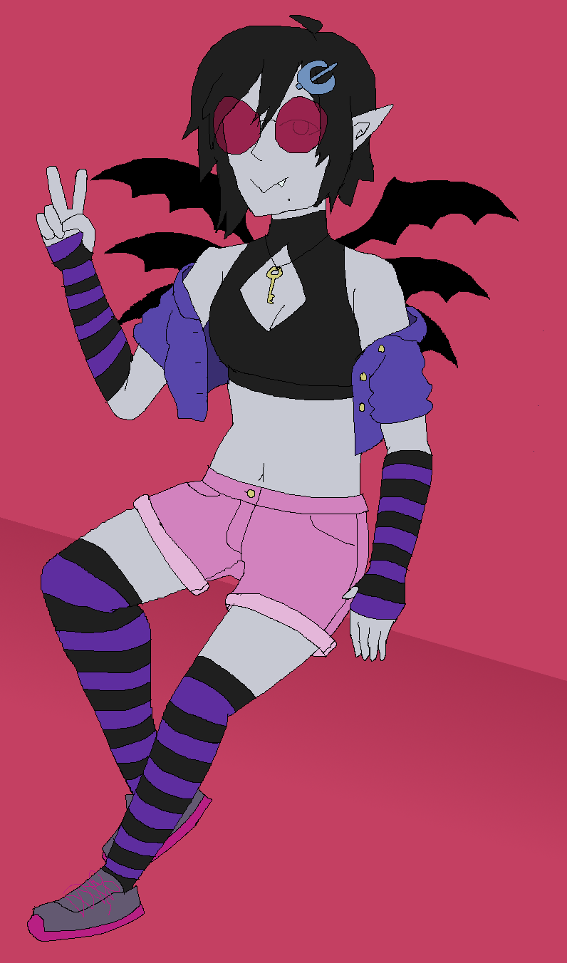
a sketch in ms paint of a concept for an original character design that i had. at the time of creation this file was simply named "vampy oc" as this was very early in the stages of creating Violetta. if you want to learn more about Violetta, click here.
may 2023
digital logo design
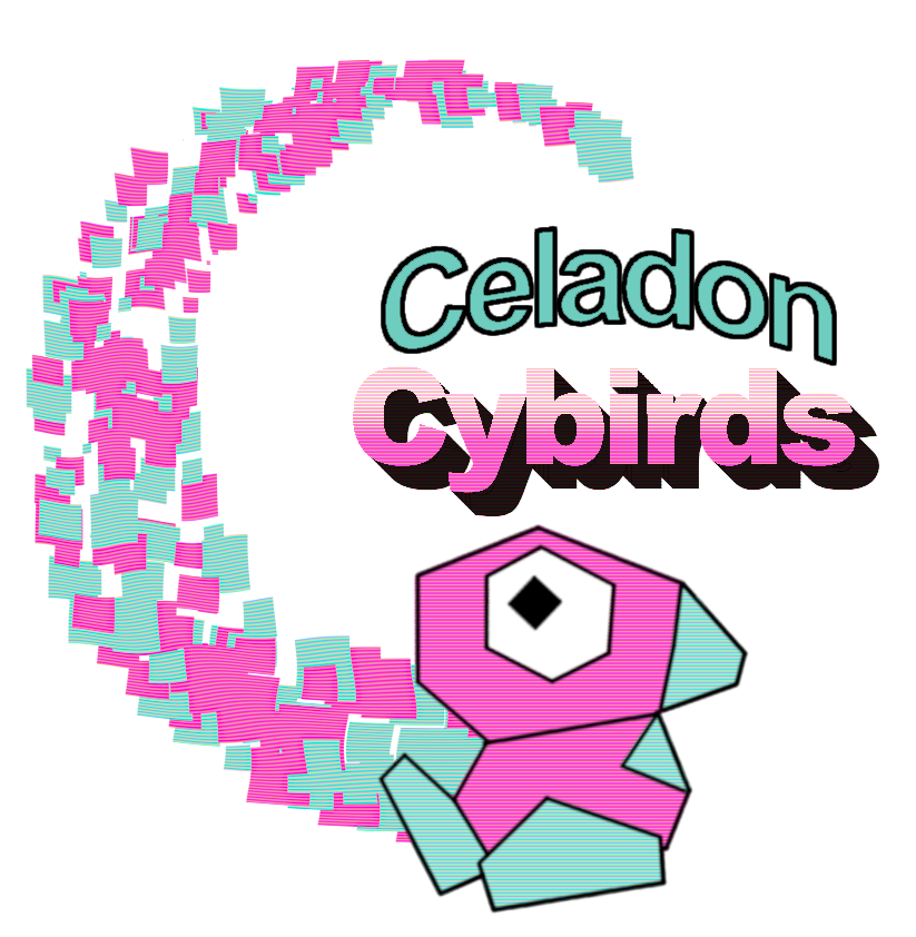
this is the logo for my team in the Kanto-based inaugural season of The Citrus League, a competitive pokemon-battling sports league between friends. the Cybirds franchise represents Celadon City in Kanto. As is likely self-evident, the team logo is based around the eponymous Porygon, The Celadon Cybird. The name Cybird is a portmanteau of cyber and bird, as Porygon is a kind of digital duck. Other names considered in the planning phase were Digiducks and Digibirds, but the elegance of Cybirds won out. As for the representative city, i was torn between Saffron City and Celadon City, both being alliterative with Cybird and having ties to Porygon: Saffron being the home of Silph Co. the implied creators of Porygon, and Celadon being consistently the only place you can actually get a Porygon as a Game Corner prize. in the end i went with Celadon, as i could use celadon (the colour) in the colour scheme of the logo, whereas saffron (the colour) wouldn't work without alterations.
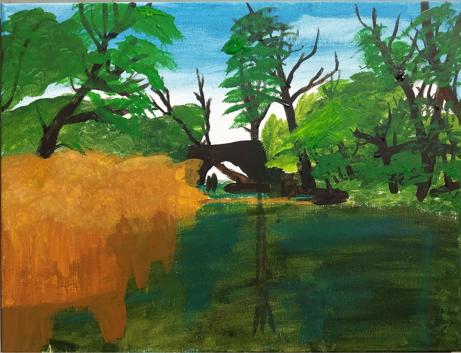
april 2023
acrylic on canvas
creek bridge is a project for a painting class i took in the spring semester 2023. there were 5 projects total, but most of them were either abstract exercises in colour choice or imitations of existing works. as such creek bridge is the only project from that class that i feel like is truly My art, and so here it lives. the painting itself depicts a photo of some natural scenery nearby my home.
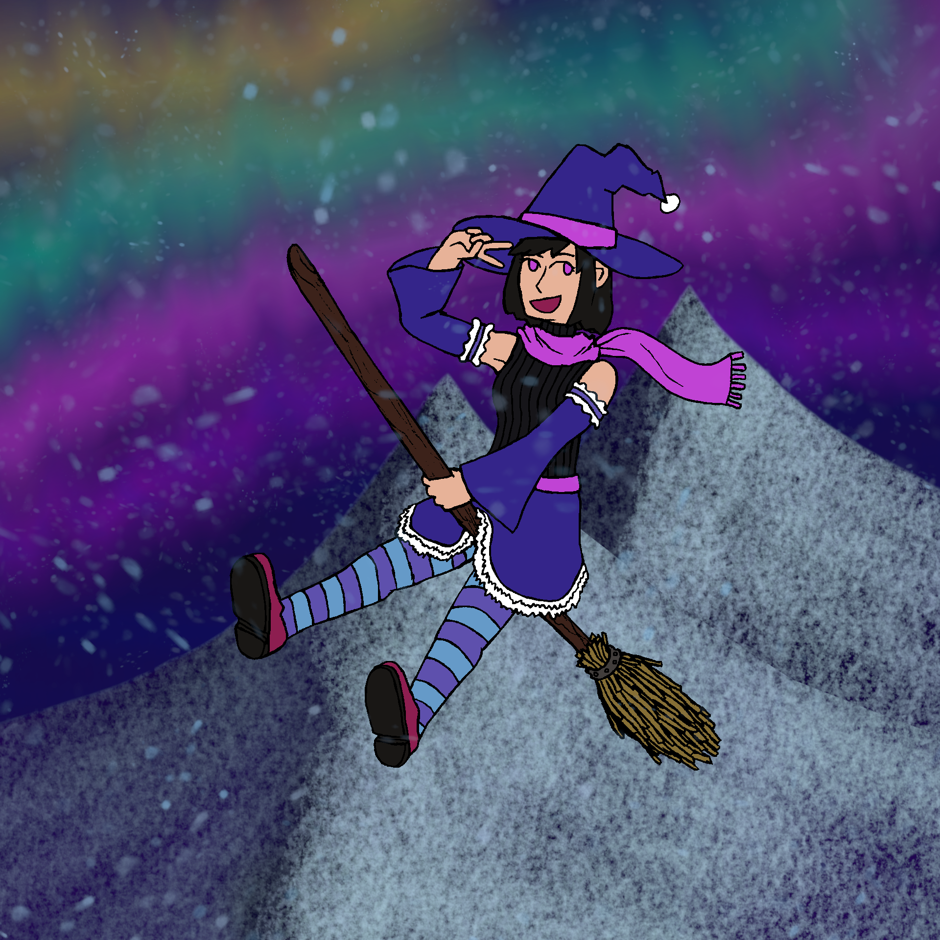
november 2022
digitized sketch + digital painting
a season-inspired piece for winter 2022, winter witch is a sort of hybrid between my pencil-sketch figure drawings and my digital landscape paintings. while its not the first time i've made a digital background to place a figure on, ones in the past were typically very simple backgrounds just meant to help frame the piece in a setting. in contrast the background in winter witch can stand as a piece on its own, and in that form it is called 'snowy aurora'. you can toggle between winter witch and snowy aurora by pressing this button (it may take a few seconds to load):

october 2022
digitized sketch + digital painting
content warning for: artistic nudity.
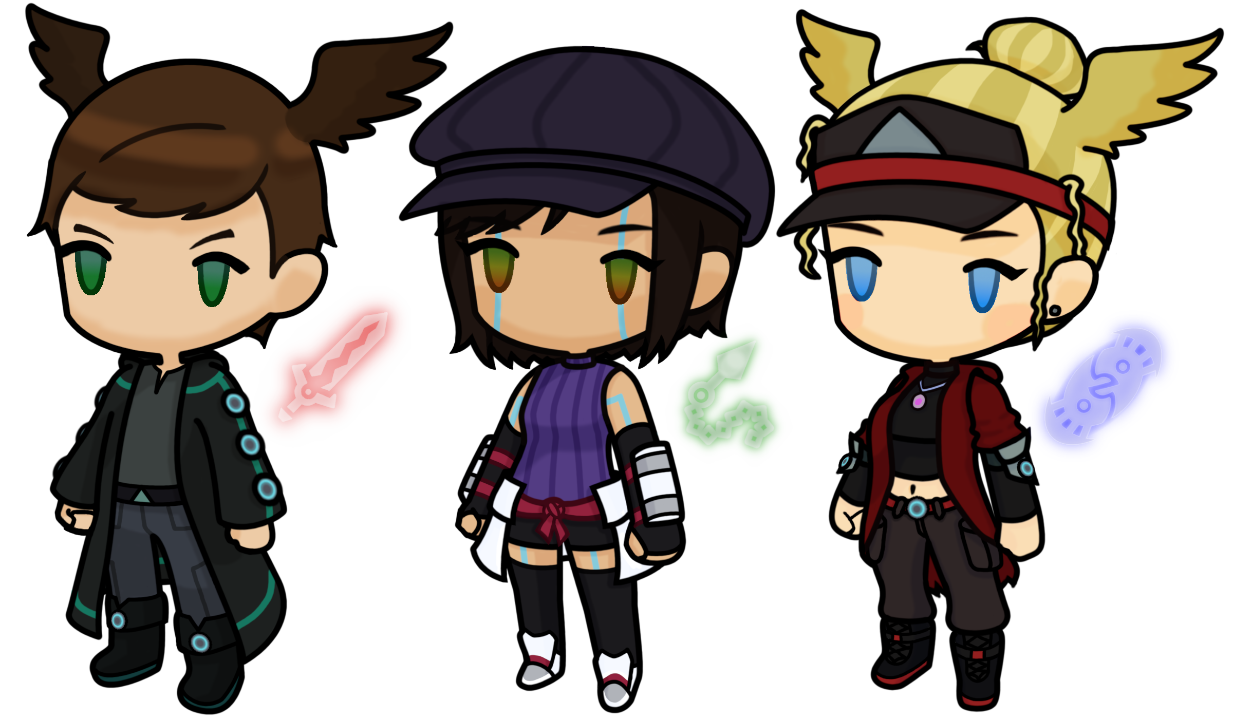
september 2022 (first two), march 2023 (rightmost)
digital character designs
these are three character sprite icons in the style of Xenoblade Chronicles 3 representing myself and two friends as we would appear as Agnian and Kevesi soldiers. on the left is my friend Styrm as a Kevesi Attacker, in the middle is myself as an Agnian Healer, and on the right is my friend Avelyn as a Kevesi Defender. sprites were made using Noah, Sena, and Eunie's sprites as bases respectively, but most of the work is original design.
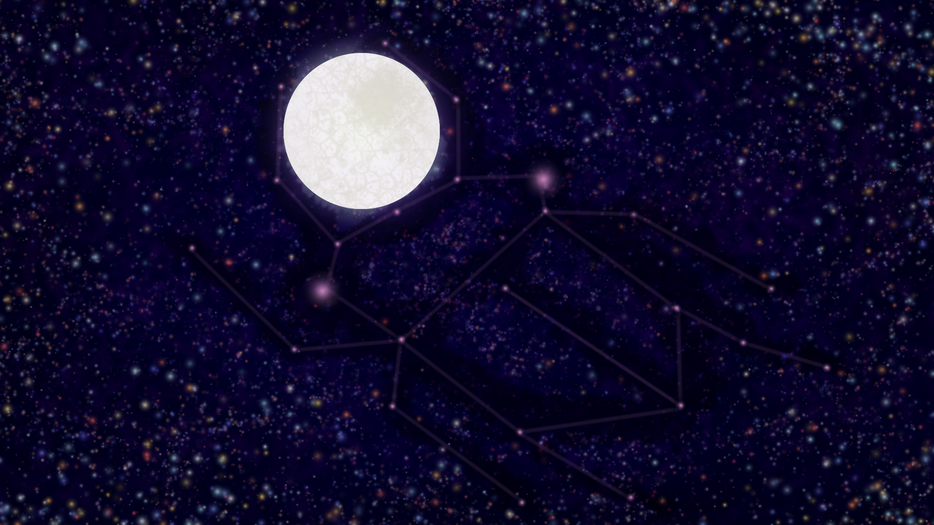
december 2021
digital painting
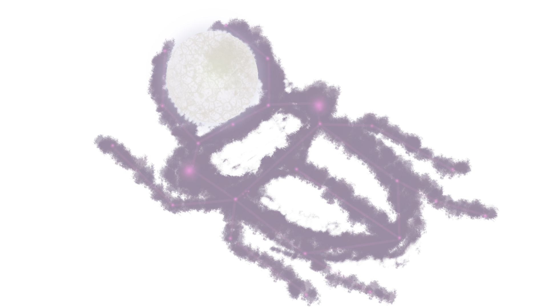
lunar scarab is probably my favourite piece i've ever done. there's really not much to say about it, its a bright scarab-shaped constellation holding the moon in its mandibles and lifting it high. this is a concept that i had been cooking for years, but had been waiting for the right time to execute it so that my abilities could live up to my vision. more so than any of my other works depicting renditions of myself, this piece is me.
november 2021
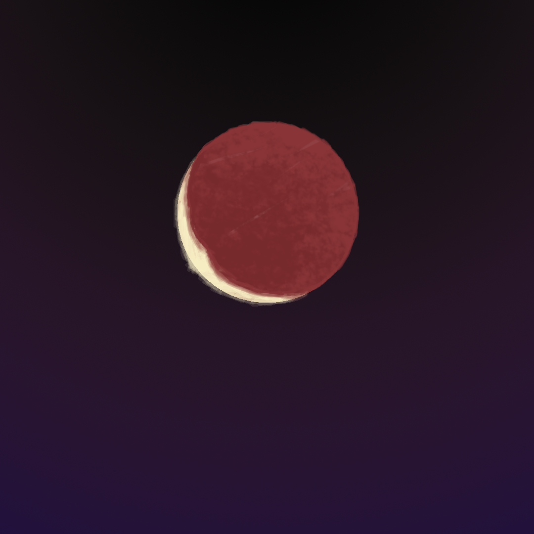
digital painting
this piece was made to commemorate the lunar eclipse that happened in november of 2021. i don't have any sort of professional camera to take a photo of the moon with, so instead i went to create a painting of it instead. this is probably one of my simplest pieces due to its subject matter and the short time span in which it was created.

october 2021
digitized sketch + digital painting
content warning for: insects, body horror, blizzard entertainment.
april 2021
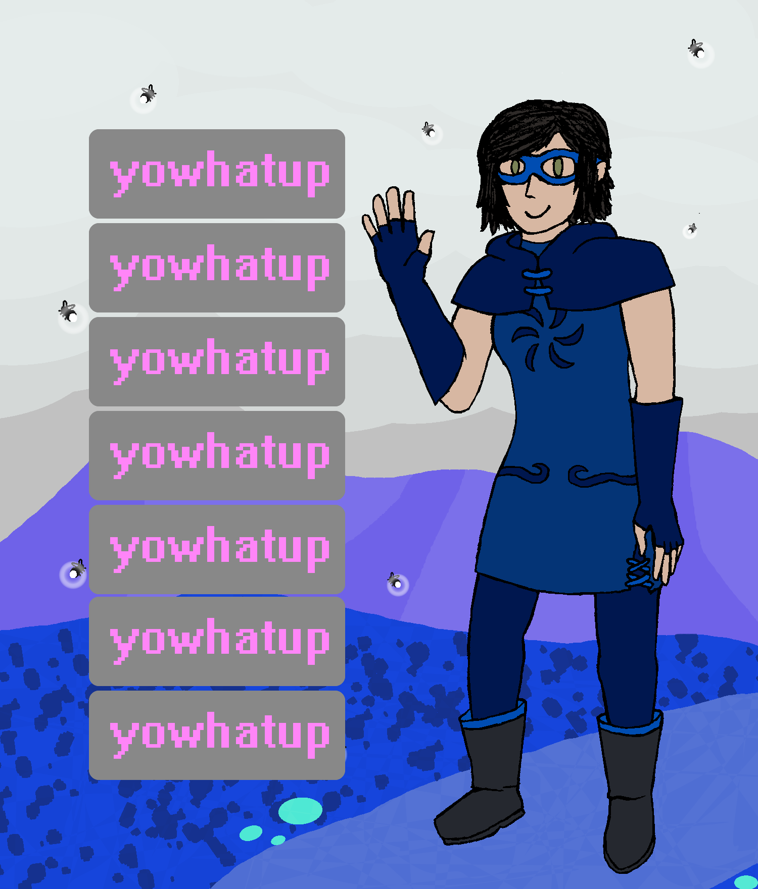
digitized sketch + digital painting
this was a piece i made to observe international Homestuck day (april 13th) by recreating my absolute favourite panel from the comic but with myself in the place of roxy. (this is what the refrance). since this is a panel recreation there wasnt much in the way of like composition or inspiration stories to tell, so... yeah. thats all lol.
oh! yowhatup in particular is a reference to Simpleflips (shoutouts to Simpleflips) who ingrained the phrase into my brain. ironically he spells it differently than i do, stylizing it as 'yo waddup'.
february 2021
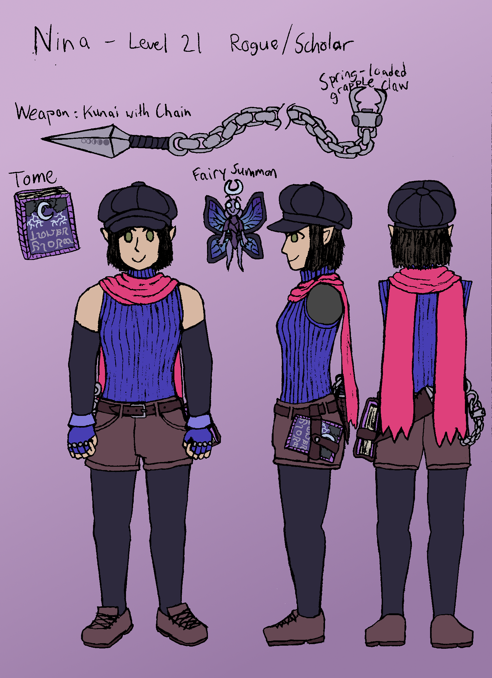
digitized sketch
this is an old reference sheet for a sona in the style of the Final Fantasy universe. the fashion is mostly inspired by the characters of FF7, with the class and weapons taking inspiration from various other games in the series. im not really a fan of how this came out, i think the proportions are really off in some places. i also think this design is a bit mid nowadays, i would definitely change this up if i were to go back to this concept. actually i already kinda did, the Xenoblade 3 sprite a few pictures up is a variant on this design and i like that version a lot more even if the differences are fairly minimal.

october 2020
digitized sketch
content warning for: spiders, body horror, gore.
june 2020 and august 2020
pixel art
a collection of trainer sprites made in the style of Pokemon Gold/Silver/Crystal on the GBC. I made a full set of sprites representing myself for use in the romhack Pokemon Crystal Clear, which has neat character customization and supports importing custom sprites. ironically after making these sprites i then proceeded to not play the actual romhack for very long before getting bored ^^;
later that year in August as a birthday gift for my friend Mike i made a battle sprite of his main sona, which was a fun process trying to pare that design down to just 4 colours and still make it recognizable. theyre a massive Pokemon fan, and are actually currently making a cool nuzlocke comic called Pokemon Constellation, which you should check out :>
may 2020
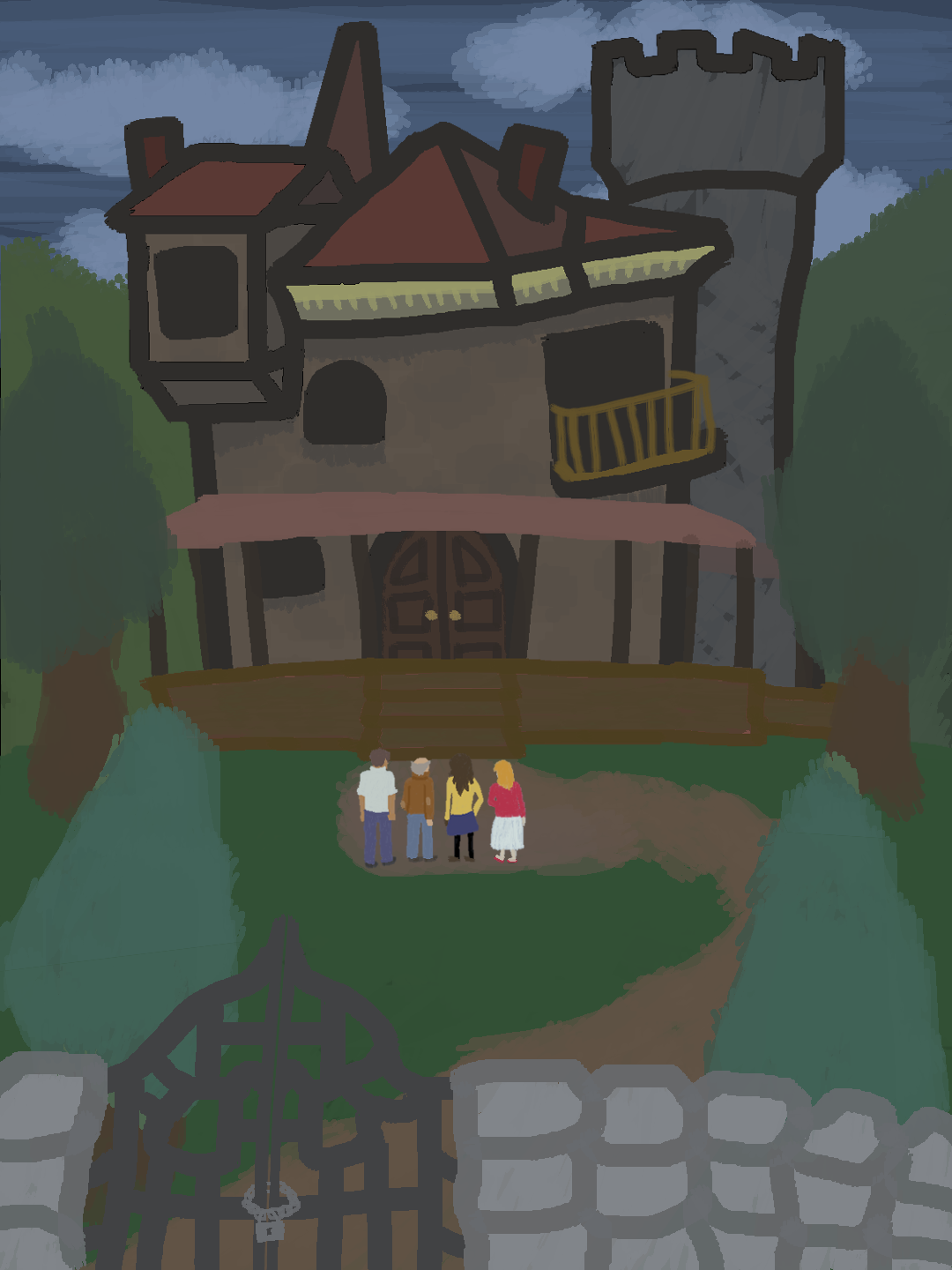
digital painting
this piece was made as part of a project for a literature class i took at the time. one of the works we had read was The Haunting of Hill House by Shirley Jackson, which if you're unfamiliar is a horror story involving four characters living in the titular Hill House and experiencing an array of paranormal happenings. the house itself is said to be built in a bizarre and confusing fashion, with many nonsensical features and crooked angles. This piece is my interpretation of what the Hill House may look like, alongside its four residents (from left to right) Luke, Dr. Montague, Theodora, and Eleanor. the idea of bizarre and nonstandard architecture has always been very striking imagery to me, so i had a lot of fun trying to piece together the house's appearance based on the descriptions given in the book. i would give examples, but that was over 3 years ago now so i dont remember any of the specifics haha.
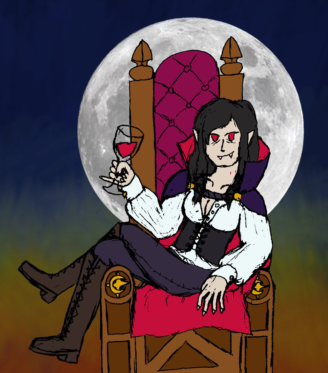
october 2019
digitized sketch over composited background
my halloween piece for 2019, and the first one of my halloween pieces in this gallery that isnt behind a content warning haha. countess nina is pretty much exactly what it says on the tin, myself as a vampire countess. very funny in hindsight that at the time i considered this 'spicy' art for showing some cleavage, when i have now done full on nude pieces lol. the outfit design is mostly inspired by generic period vampire outfits, nothing crazy there. interestingly i think this is the longest hair that i've ever drawn myself with, tied with my 2020 halloween piece, but unlike that one where i genuinely did have long hair from not getting it cut all pandemic, i believe i actually had short hair around this time so this one was a stylistic choice. probably inspired by the various long-haired castlevania characters. something that may be obvious is that this background is not actually something i made, i simply took a zoomed-in chunk of the sky from my last painting and combined it with a png of the moon i got from NASA i believe. i still really like the character design and posing of this one, but the laziness on the background is kind of embarassing to look back on now haha.
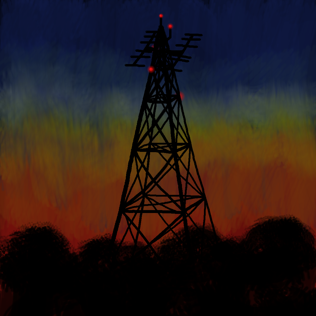
september 2019
digital painting
dusk tower is sort of an odd one out among my paintings. typically i prefer to paint more natural scenery and/or celestial objects. dusk tower is explicitly not that, as the focus of the composition is the titular cell tower silhouetted against the sky at dusk. the inspiration for this painting actually came to me while i was riding home from a sports game and saw basically the exact scene depicted in the painting out of the car window. it was such striking imagery that it stuck in my mind and made me think 'i want to paint this', so i did. im very proud of how this piece turned out, the sky in particular has a really interesting texture and colour blending to it that almost emulates a physical oil painting, and the juxtaposition of it against the stark black rigid lines of the tower make for interesting visual contrast.
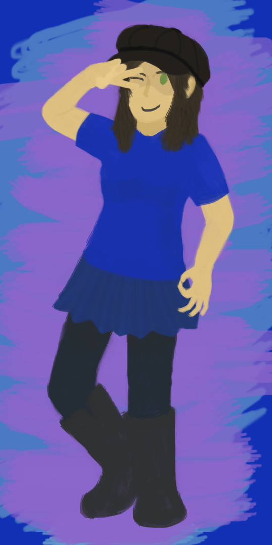
august 2019
digital painting
a self-portrait of myself done in an experimental style where instead of my usual way of drawing people where i create a sketch with paper and pencil and then scan it in, i went for a lineless style, skipping straight to painting using different colours and shading to help distinguish edges and textures. i think it worked pretty well, but overall i prefer working with a pencil sketch done first since its easier to showcase smaller details and texture that way imo.
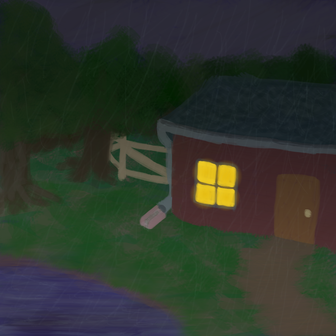
july 2019
digital painting
rainy cabin is a simple piece, i was going for a sort of cozy atmosphere here with the heavy rainstorm outside paired with the warm glow emanating from within the cabin. i really love rain, the sound of it, the feeling (when its not too hard), the way it tints everything a dark blue, etc. a lot of my old paintings have rain and tbh i should make more its been too long since i made a rain piece. this is not really relevant to rainy cabin but i really want to try making an animated rain painting sometime.
march 2019
digital painting
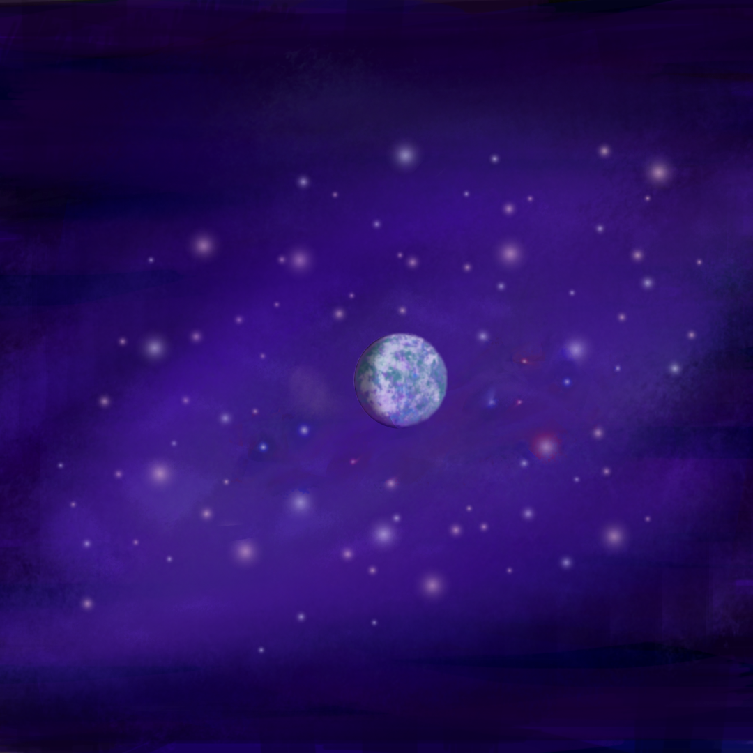
galaxy brain is a fairly simple piece, just a strange planet floating in space in a sort of purple nebula with a bunch of differently coloured stars. this has definitely been overtaken by lunar scarab as a depiction of a starry sky, but i still think galaxy brain has some nice qualities to it. i do like the way that the planet turned out, with the strange colour scheme blocked by clouds and the shading to showcase its dark side away from whatever sun it orbits. honestly the biggest problem with this one is that the name makes no sense and is just there as a reference, nothing about this piece is a galaxy its just a single planet with a bunch of faraway stars.
november 2018
ditigal painting
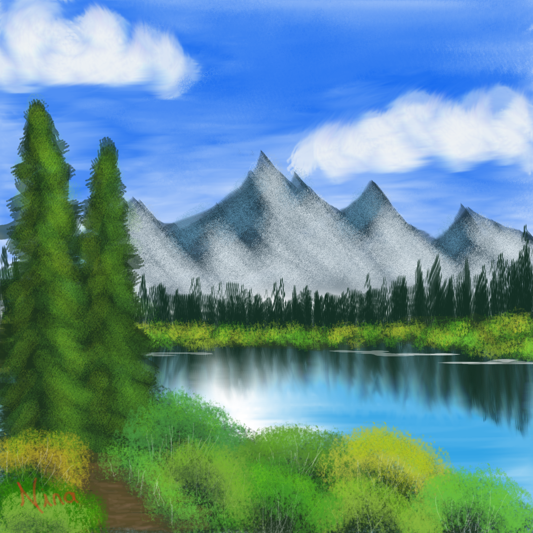
this was a paint-along of Bob Ross's The Joy of Painting, specifically S14E01 Distant Mountains. of course this was done digitally instead of physically with oil painting as Bob does it, so i had to try a lot of interesting techniques to replicate what he does in a digital form. this was a really fun experience, and it helped a lot in training my skills in how to render digital paintings to sort of mimic traditional painting textures and tools. given the difference in medium, i'm actually really proud of how accurate to the real deal this piece turned out, even if i had to pause Bob a lot in order to catch up. it really made me appreciate how much quicker colour selection is on a physical painters palette where you can just mix stuff and edit it until you get what you want, rather than fiddling with a bunch of sliders and levels.
november 2018
digital painting
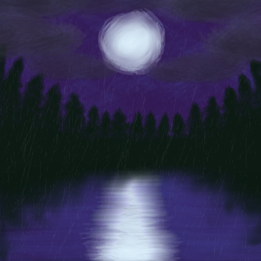
midnight storm is one of my earliest digital paintings, and the first one where i didnt sketch out a plan on paper ahead of time. despite that, i think midnight storm is still probably one of my favourite pieces. the simplicity of its imagery and colour scheme helps a lot i think, with the only real colours of note being the dark purple of the sky, the black of the treeline, and the white of the moon (with some subtle gray for the stormclouds). i use this image as my icon for my art-based twitter/tumblr accounts since i think its a standout, and making it the icon ensures its seen by visitors despite its age.
april 2018
digital painting
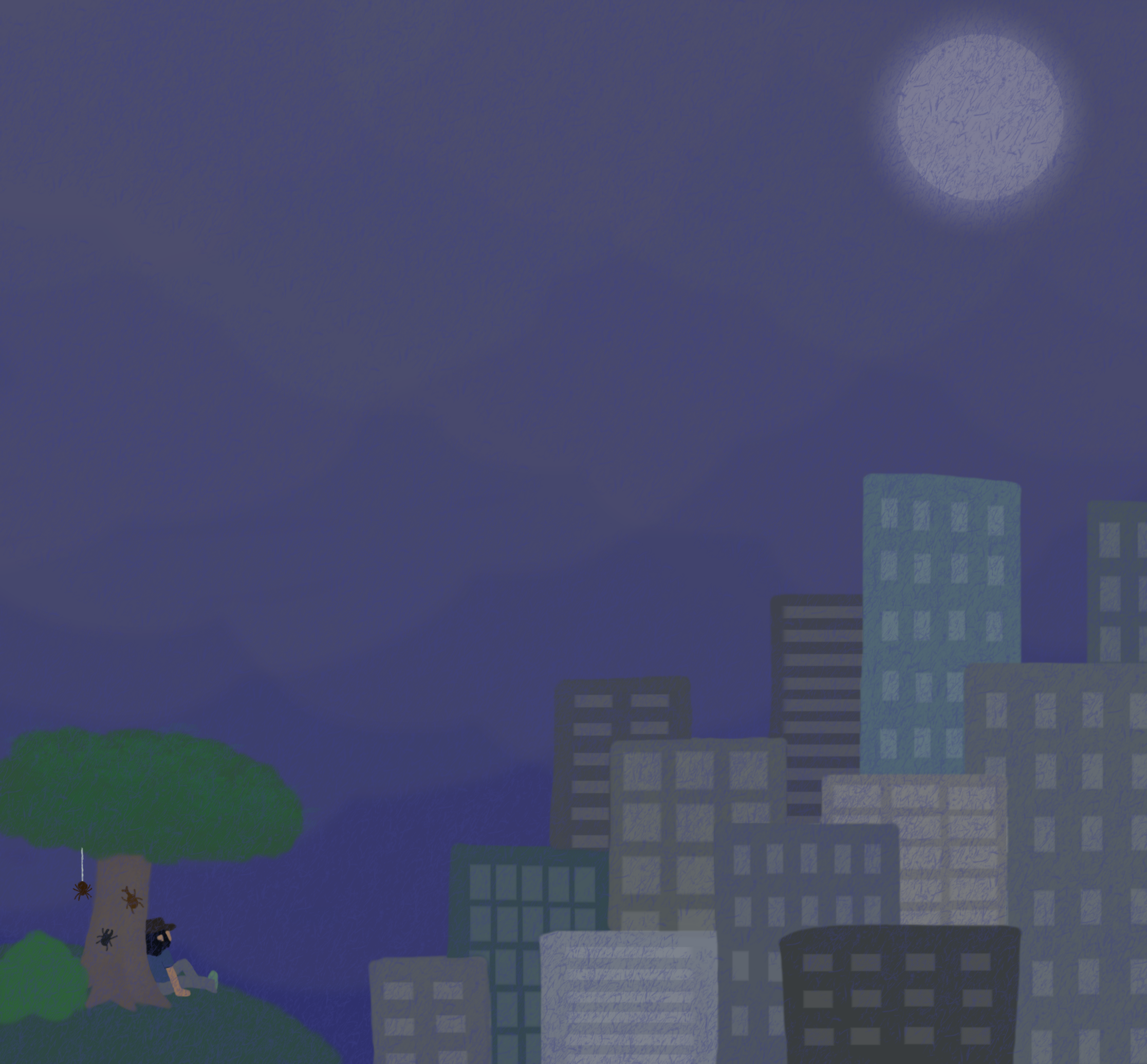
rainy overlook is what i would consider my first digital painting. the idea behind this one was that i wanted to try and make a nice computer/phone background, and wanted to make an image that incorporated a lot of various aesthetics that i was into at the time. some of these were incorporated better than others, and i think overall the composition is a bit messy with nothing really drawing the eye in. trying to include insects, a cloudy+rainy sky, the moon, and a cityscape all into one was a bit of a mistake, and i've since made paintings that focus on just one or two of these combining that work much better, such as midnight storm and lunar scarab. i also am not really into Big Cities anymore now that i have had actual experience visiting some lmao. theyre cool but i dont think i would really want to live in one. either way, regardless on my feelings on the actual piece, this still holds importance as the start of my journey as a digital painter. while i have been making art basically my entire life, this is about the point where i would say i became an Artist.
thank you for taking this journey back in time with me, i hope you enjoyed what you saw :>